Le Cargö s10
Le Cargö
Visual identity for season 10
Secteur
Arts & culture
2015
The Cargö team asked the agency to work on a world that employs plastic material in connection with the site and its location. Le Cargö is an iconic place in Caen; atypical, it was one of the first buildings to be built on the peninsula, a former harbor district which is now disused and today in full rehabilitation, particularly on a cultural level.
Identity
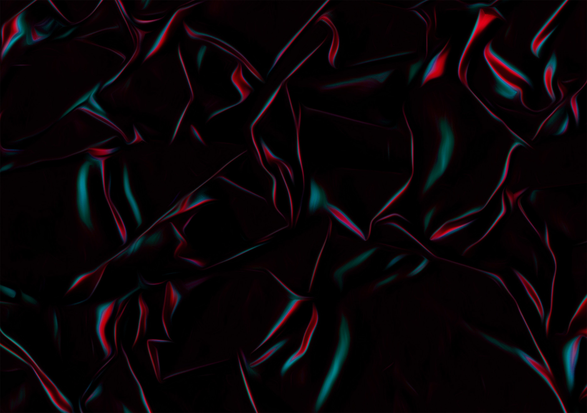
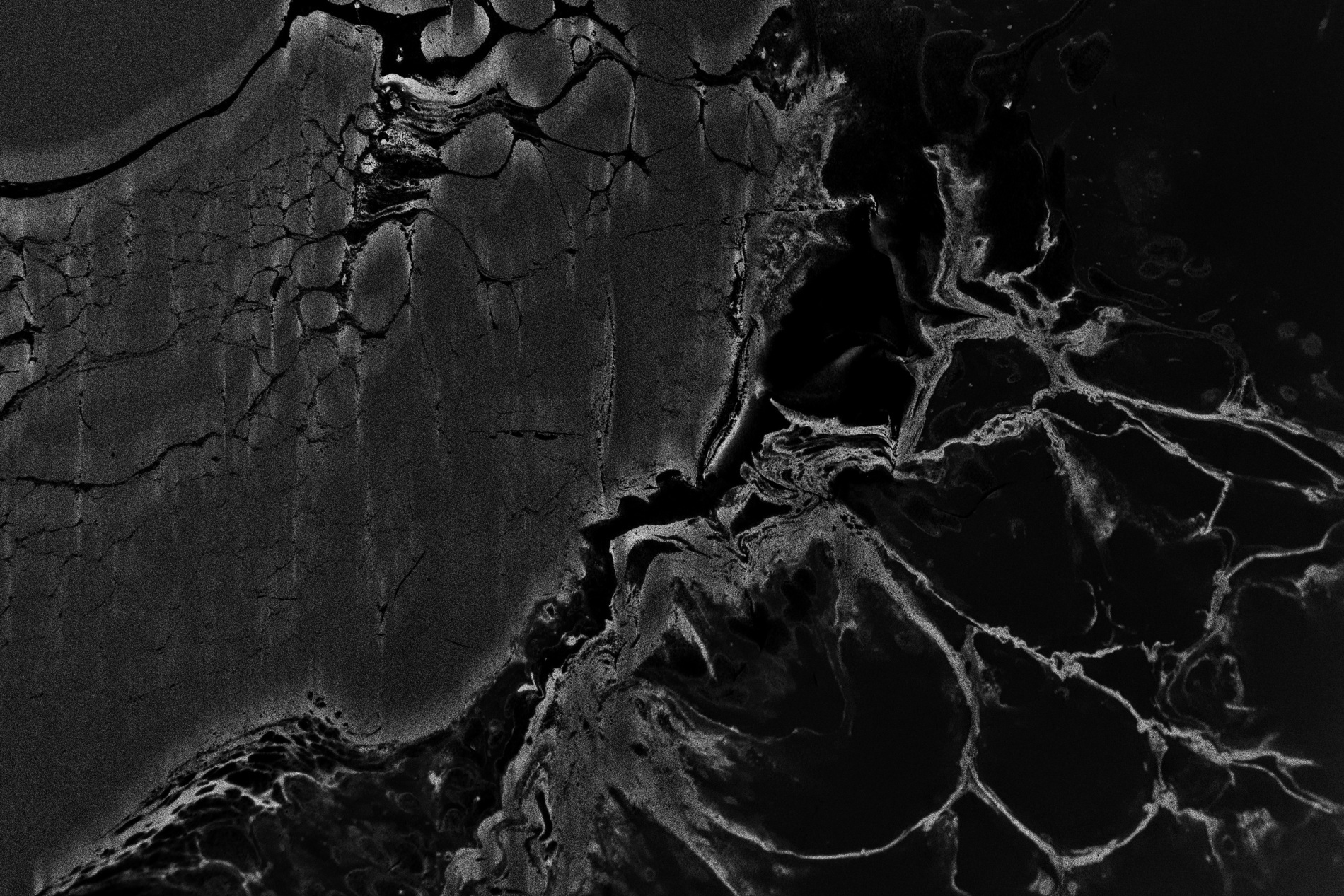
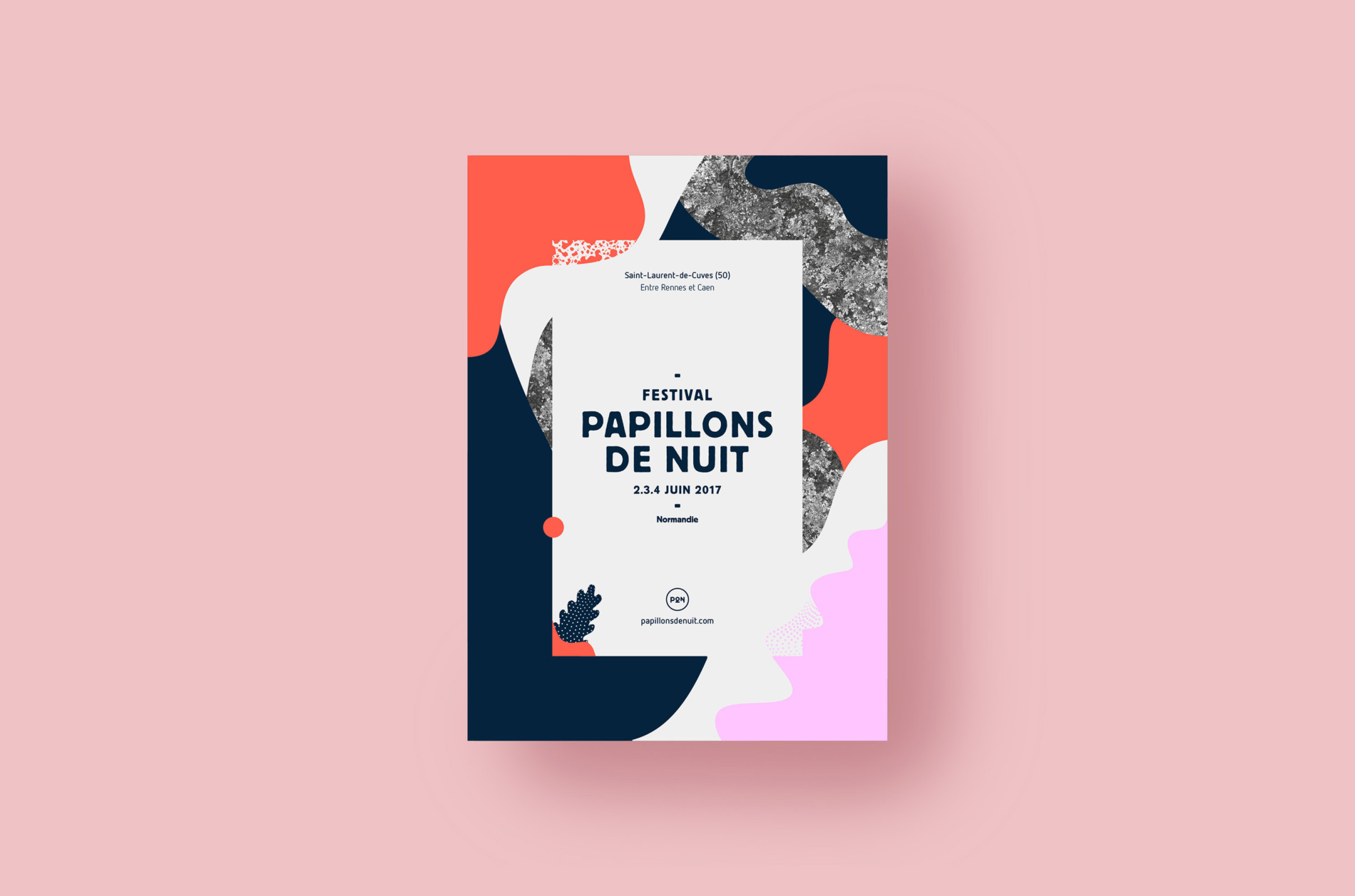
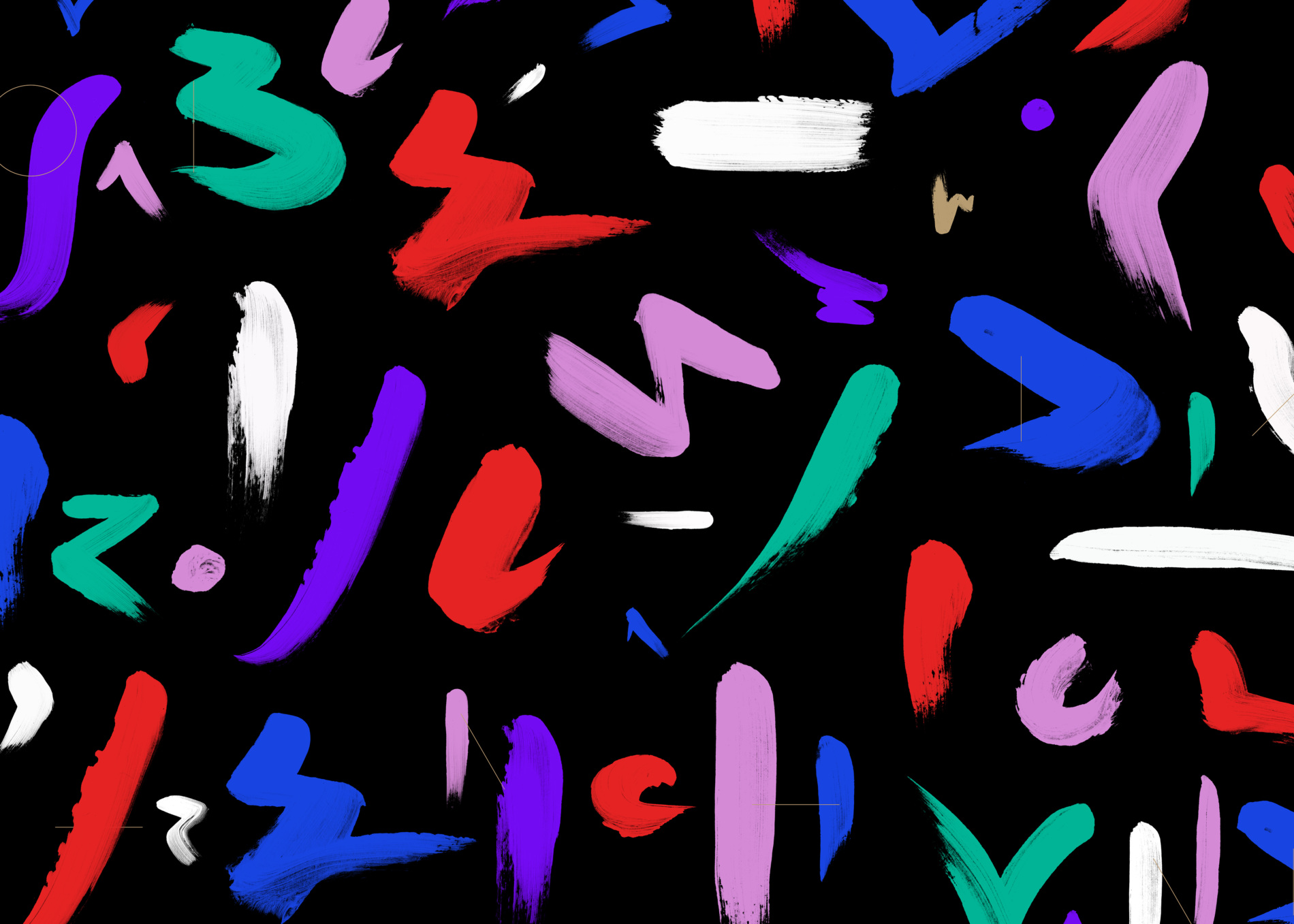
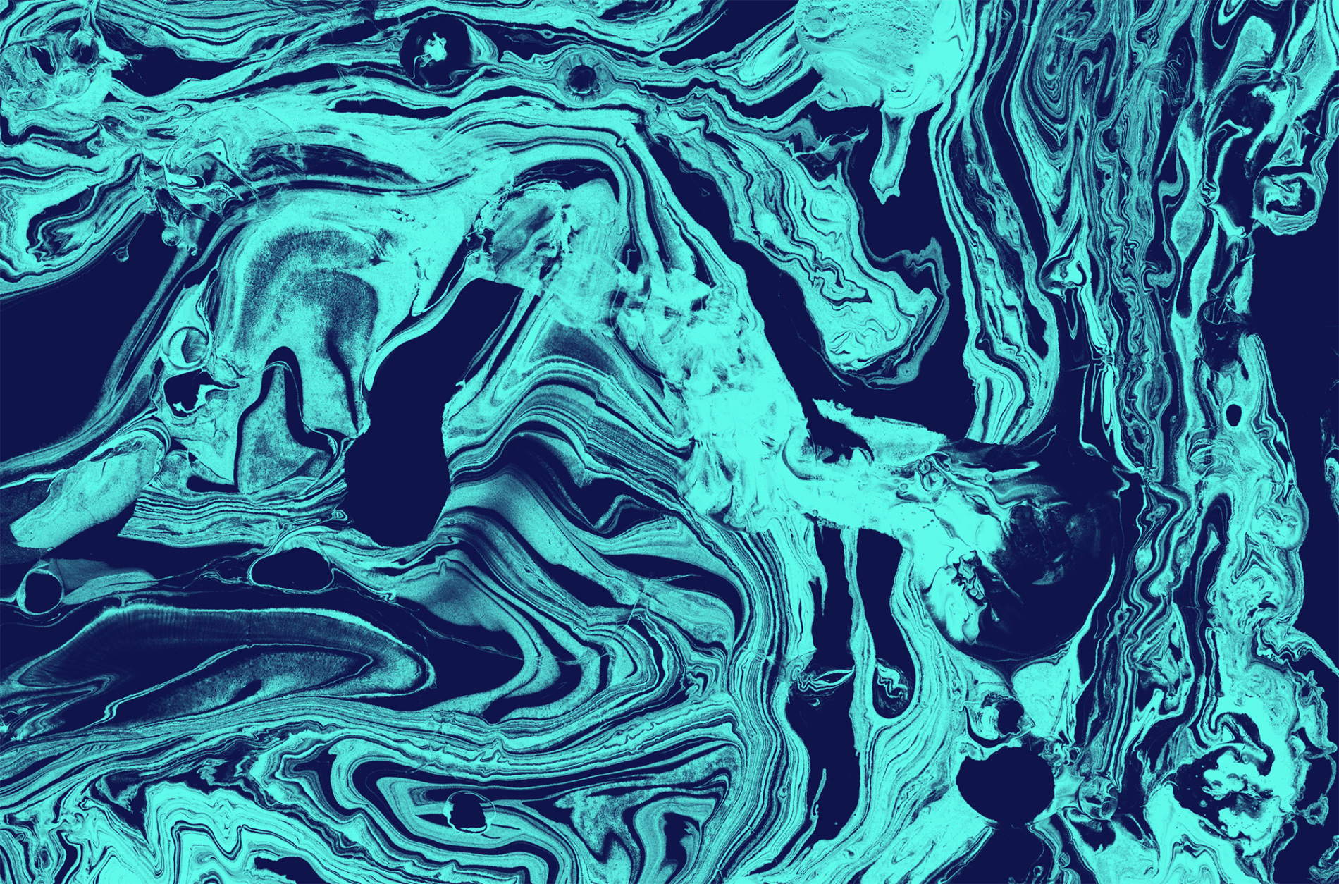
The agency has come up with a visual identity which has been created using the technique that involves the transfer of ceramic inks in the design of objects. Paint is dropped into water and spreads until you secure, by means of a well-controlled game of chance, the composition and graphic abstraction you wish. This material that has been designed floats to the surface and is applied onto the paper by means of a transfer process. We then designed shapes from this substance in order to enable us to clear spaces, gaps, and play on compositions which would prove favourable to laying out the line-up. In certain areas, we incorporated a resolutely digital material, a digital sound, which adds a contemporary note and depth to all the various compositions.
Season 10.1
For the first quarter of the year, Season 10.1, the agency took into account the wishes the Cargö’s communication team had formulated, mindful about renewing the concert hall’s image by relying on the codes and architectural notions that are so distinctive of the site. We therefore favoured substances, with a play on colours. Around the copper pantone and its natural complementary colour that is verdigris, in its most electric and current version, we have designed an identity that is efficient and coherent, that mirrors the image of the building and the performers it welcomes.
Season 10.2
To announce the line-up of the second quarter, the substance has changed and a new colour is incorporated into the composition.
Season 10.3
To advertise the spring quarter, our choice went towards warm colours featuring an ever-moving substance.
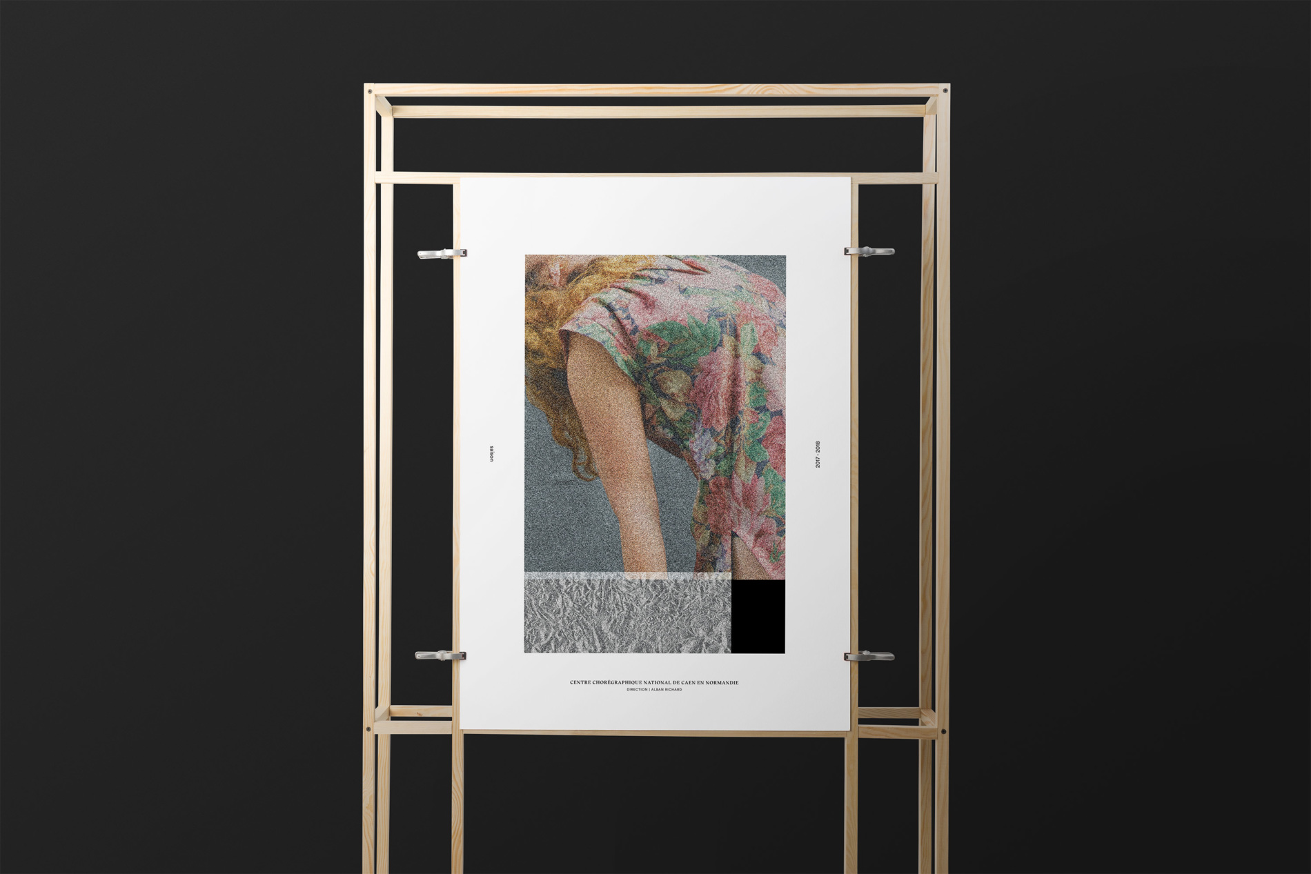
For each season, a series of flyers accompanies the line-up release and offers a wealth of variations, enough to reveal the overall graphic world and boost the advertising campaign. The notion of collection and series causes the public’s attention to be further caught.
Credits
Art Direction
Julien Alirol
Paul Ressencourt
Graphic Design
Guillaume Brindon
Project Management
Damien Bullet