Nördik 17
Nördik Impakt
Visual identity and website of the 17th edition
Secteur
Arts & culture
2015
For its 17th anniversary, Nördik Impakt – the electronic and independent culture festival hosted in Caen by the ArtsAttack! Association – has renewed its trust in our agency to conduct its overall advertising campaign for the 5th year running. We have designed a singular, strong and viral visual identity, the potential of which we have exploited to the full.
Awards
- Awwwards — Honorable mention
- Site Inspire — Featured
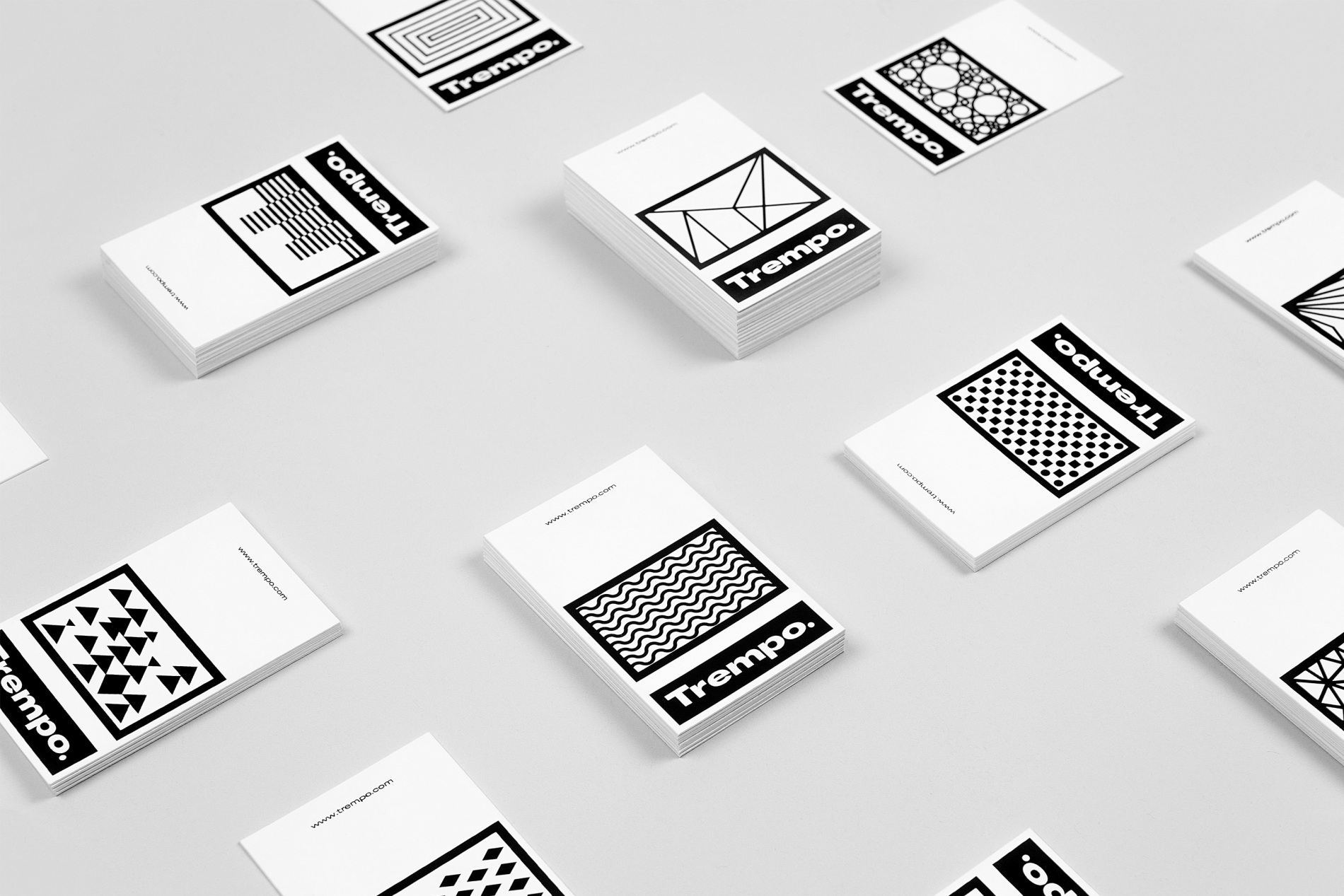
Identity
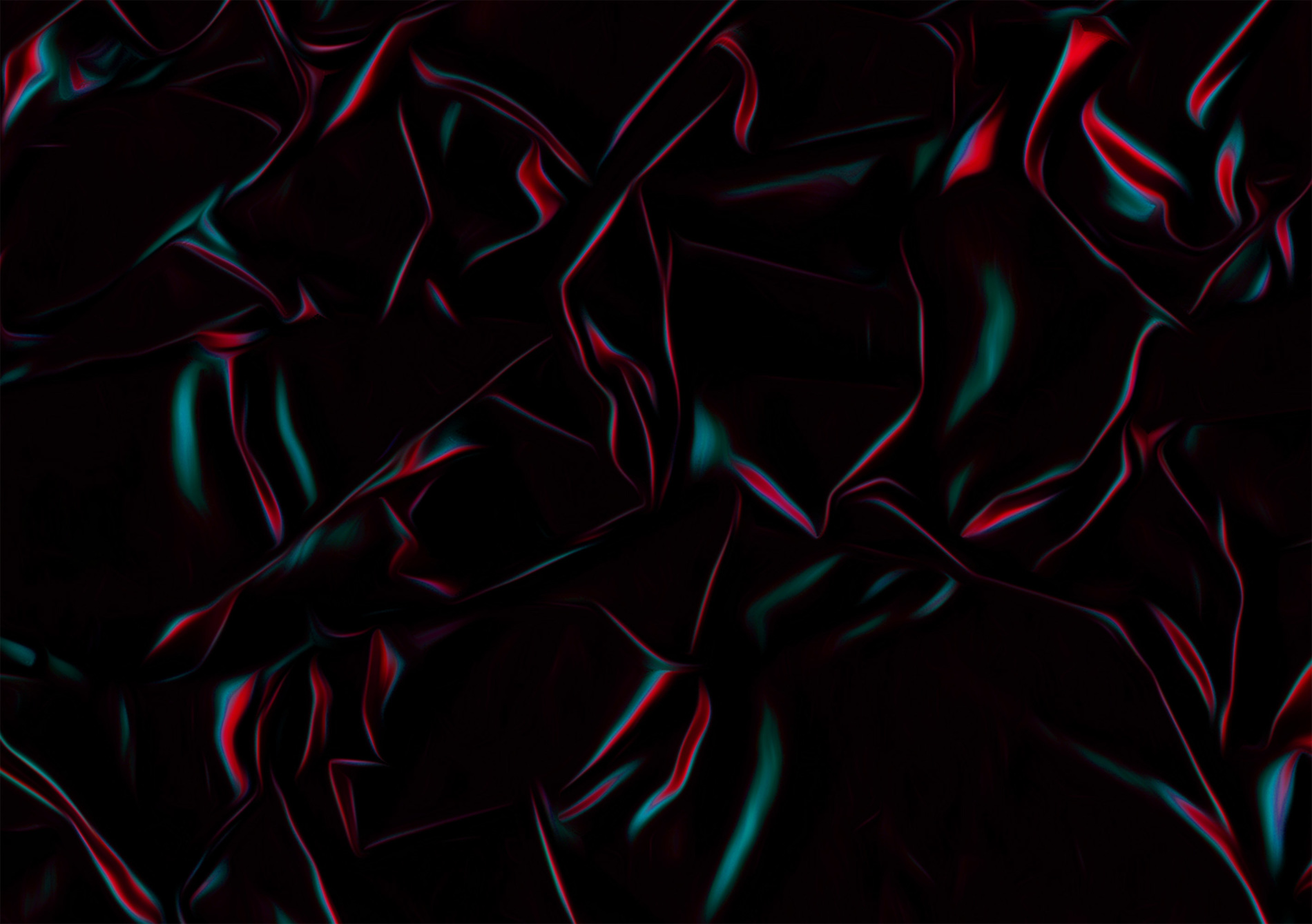
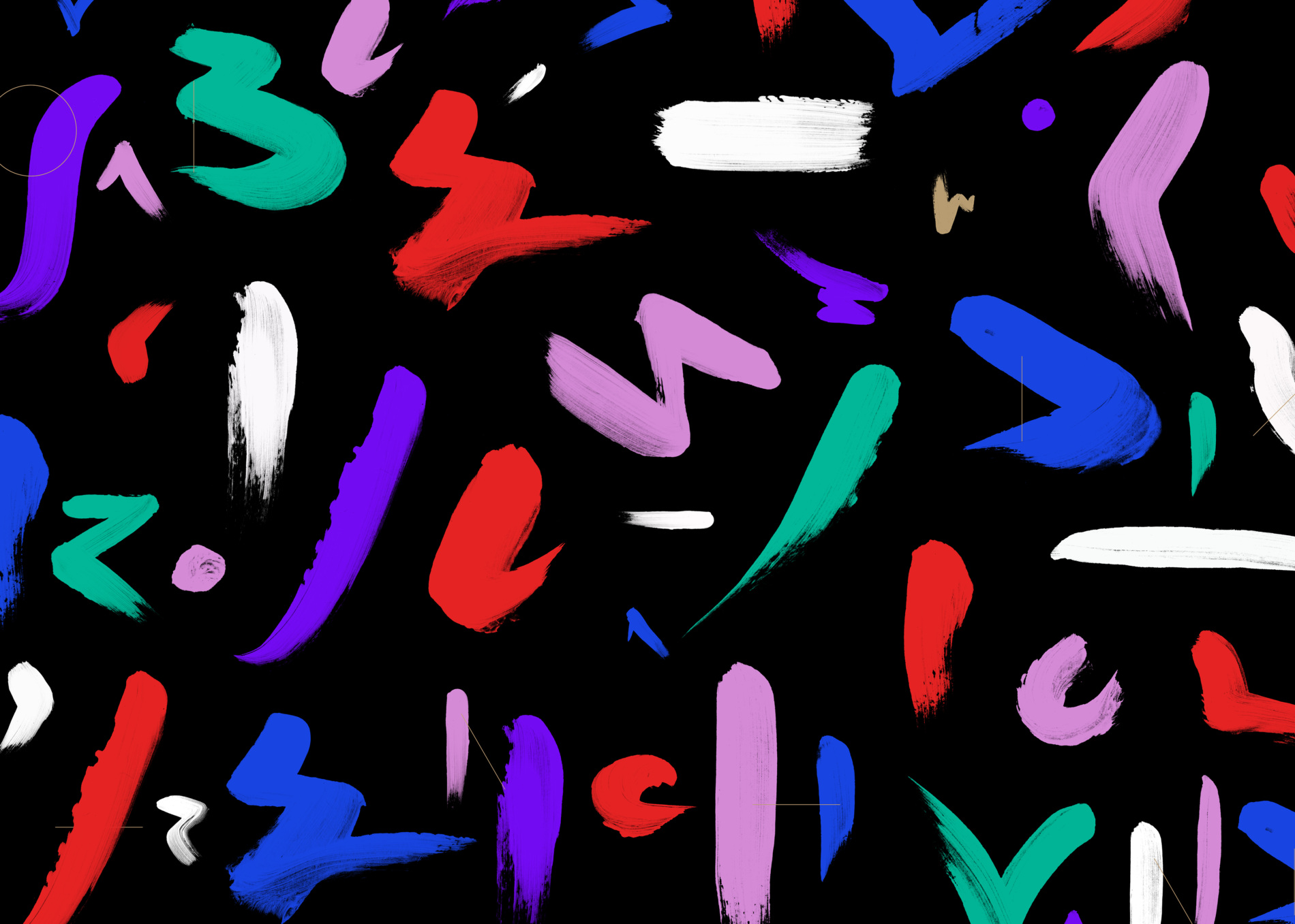
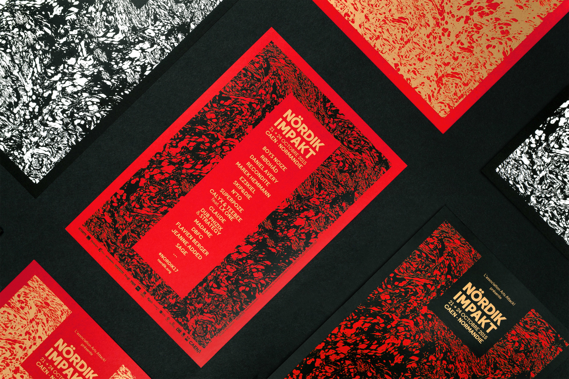
Our wish was to come up with an edgy and vibrant visual identity based on an especially strong, dominant colour. The graphic design rests on the pairing of this colour with an abstract graphic material which has been created by subtly blending references to art movements and current digital techniques. The overall composition is outlined by minimalistic geometric shapes which have been created using a metallic pantone, which adds shine and elegantly highlights the lineup.
Alphabet
Mirroring this viral marketing campaign, the material creates a typographic symbiosis. NDK is its digital symbolisation.
The pairing of a golden metallic colour with an electric red graphic pattern reveals a strong and viral graphic style, whilst remaining subtle and elegant. Golden geometric shapes play perfectly with the light and add an electronic note which echoes “glitch” influences which also appear in our digital campaign.
Communication
We believe that the strength of a marketing campaign lies in the singularity and relevance with which the graphic design is adapted, depending on the format each piece of advertising material is given, to circulate.
Digital
The agency has developed a website that meets the needs of both festival-goers as well as those of the Nördik Impakt teams before, during and after the festival.
We used WordPress, a CMS which enables the website to be easily and quickly administered and enables absolute freedom when it comes to adapting the website to the graphic charter.
Responsive
Regarding festival-goers, 60% of them look up the website using a mobile phone, witnessing high traffic during the event. The media is therefore perfectly optimised, be it on mobile devices, tablets or desktop computers.
Merchandising
The agency has taken advantage of the fact goodies were being made to reveal creations that showcase their graphic material, at a cross between object design and the influences of Memphis design and textile design.
Credits
Art Direction
Julien Alirol
Paul Ressencourt
Front-end Development
Guillaume Morisseau
Graphic Design
Guillaume Brindon
Project Management
Damien Bullet
Other projects
-
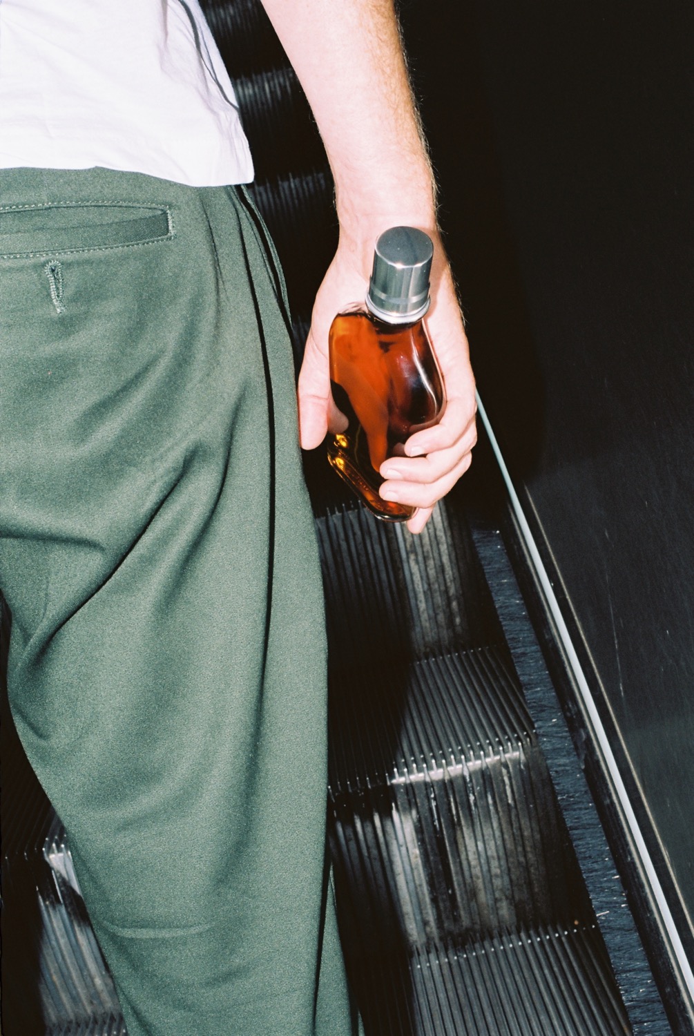
Calvados
Calvados Identité visuelle et image de marque pour le spiritueux Calvados

-
CCN s15-16
CCN s15-16 Visual identity season 2015-2016

-
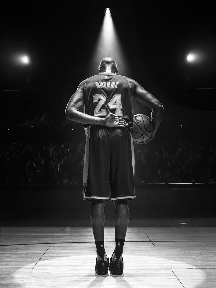
Nike ⚡ Kobe
Nike ⚡ Kobe Artwork for the 2017 Kobe Bryant T-Shirts collection

-
CCN Caen
CCN Caen Visual identity, branding and website

-
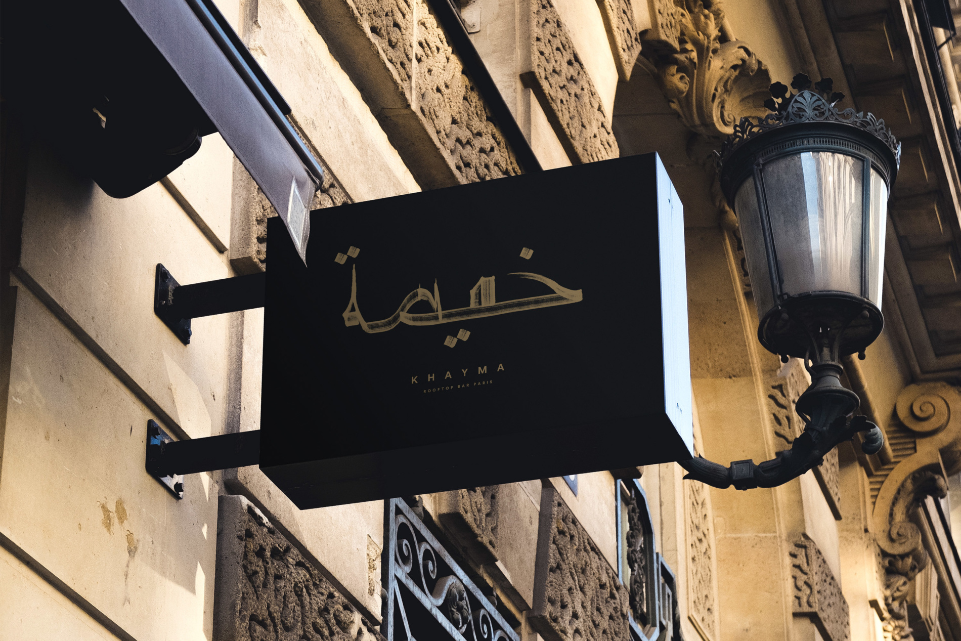
Khayma
Khayma Visual identity for a rooftop bar